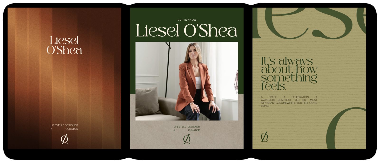
Understated luxury, natural warmth and timeless design, where quality is communicated through the details rather than excess.

Logos
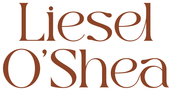
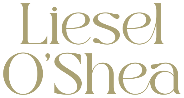
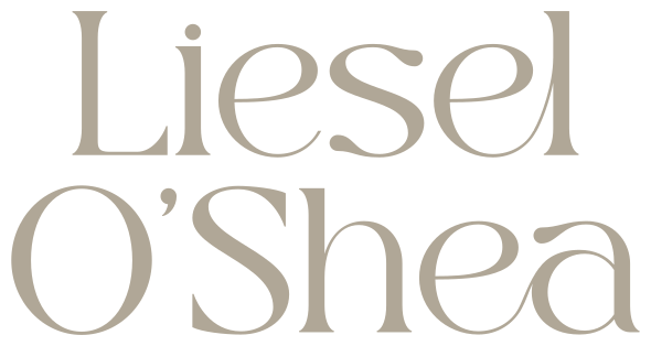
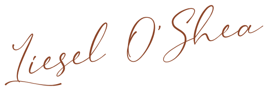
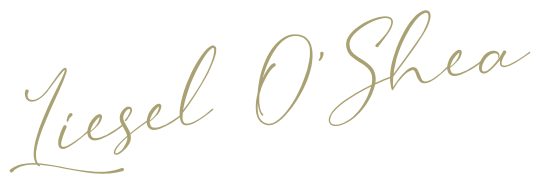
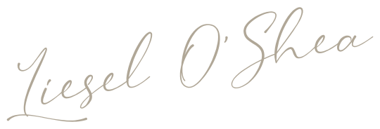
Liesel's logo system is distinctive, versatile and cohesive. Proportions, orientation and silhouette must never change, and logos are only applied in colours from the official palette.

A minimalist wordmark with personality carved in the details, soft flowing curves with graceful connecting lines.
An alternative orientation for layouts where a stacked form gives better fit or balance.
A more personal, editorial accent. Always used near the Primary Logo.

An emblem of understated luxury for stationery, packaging and social.
Colourways · Download SVG



Colours
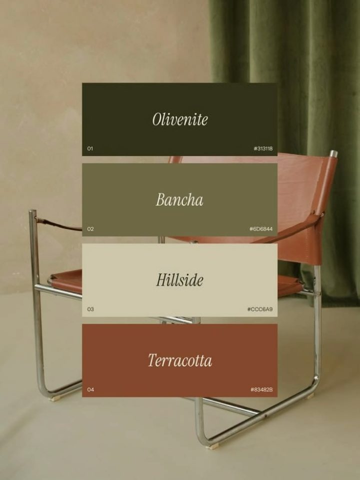
A palette drawn from nature: moss, terracotta, warm mushroom, olive and ivory. The strongest pairings put Moss Green or Terracotta against the lightest supporting tones.
The core brand colour. Calm, confident, sophisticated.
- Hex
- #253919
- RGB
- 37 57 25
- CMYK
- 75 50 90 61
Warm and expressive, adds depth and character.
- Hex
- #8C4427
- RGB
- 140 68 39
- CMYK
- 30 77 93 28
A soft, earthy neutral for quiet backgrounds.
- Hex
- #B0A797
- RGB
- 176 167 151
- CMYK
- 33 30 40 0
Light, muted green for tonal variation.
- Hex
- #AAA173
- RGB
- 170 161 115
- CMYK
- 35 30 63 2
Warm light neutral, never stark white.
- Hex
- #FAF1E3
- RGB
- 250 241 227
- CMYK
- 1 4 10 0
Typography
Bergola carries headlines, Proxima Nova keeps body copy clean and readable, and Wistania adds a personal touch used sparingly for short accents.
Aa Bb Cc Dd Ee Ff Gg Hh Ii Jj Kk Ll Mm Nn Oo Pp Qq Rr Ss Tt Uu Vv Ww Xx Yy Zz 0123456789
Proxima Nova is licensed separately from Mark Simonson Studio. Mulish is the free stand-in used on this page.
Aa Bb Cc Dd Ee Ff Gg Hh Ii Jj Kk Ll Mm Nn Oo Pp Qq Rr Ss Tt Uu Vv Ww Xx Yy Zz
Considered by Design
She works across interiors, events, wardrobes, and lifestyle to create experiences that feel considered without feeling over-designed. Her approach is rooted in curation, bringing together the right spaces, objects, materials, and details to create a distinct sense of place.
Photography
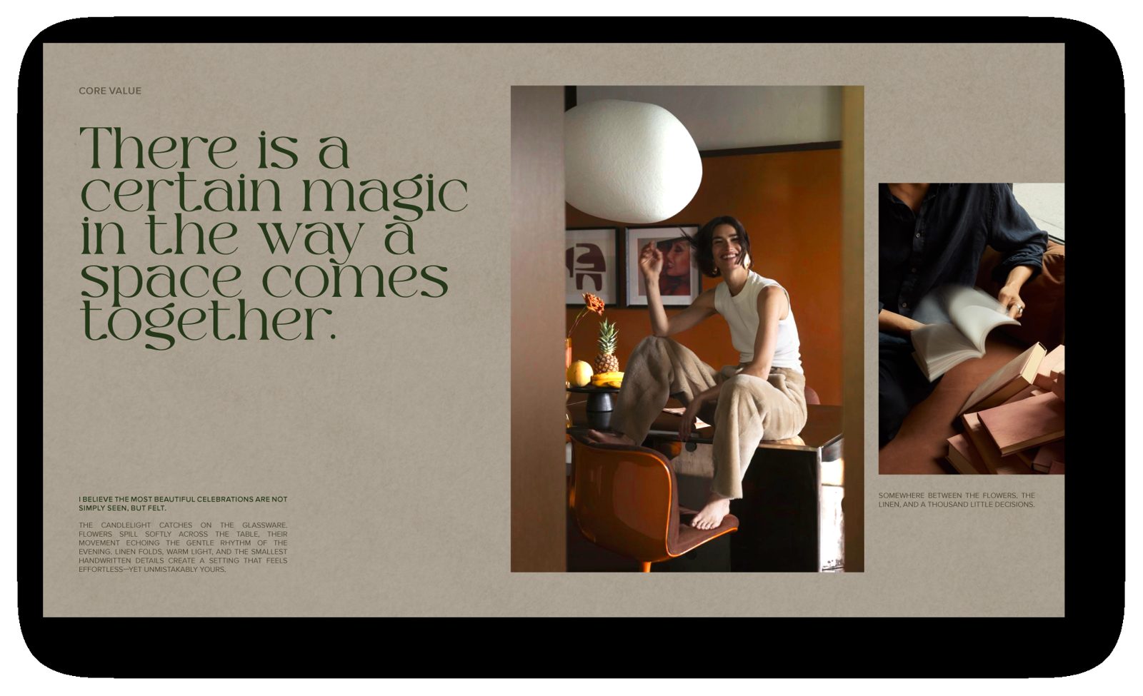
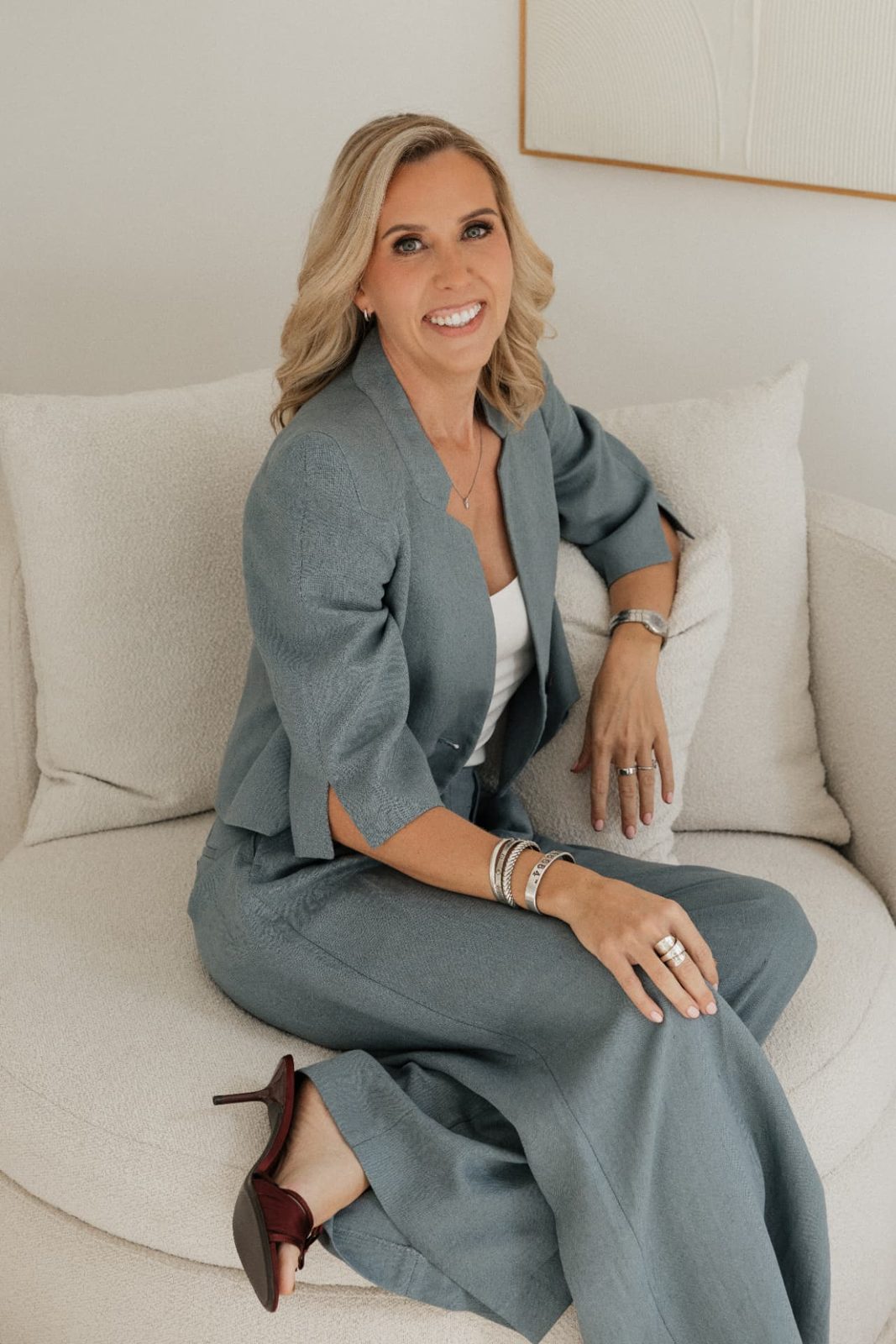
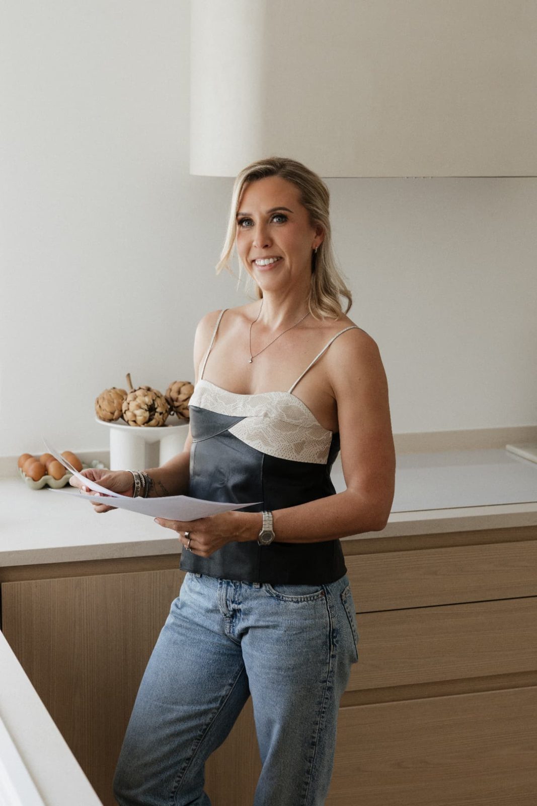
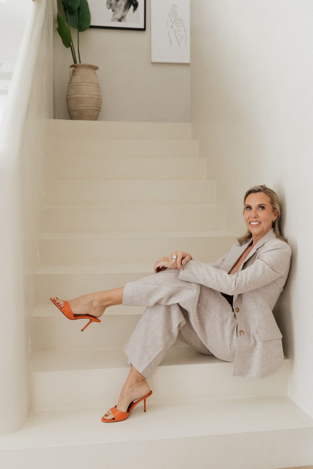
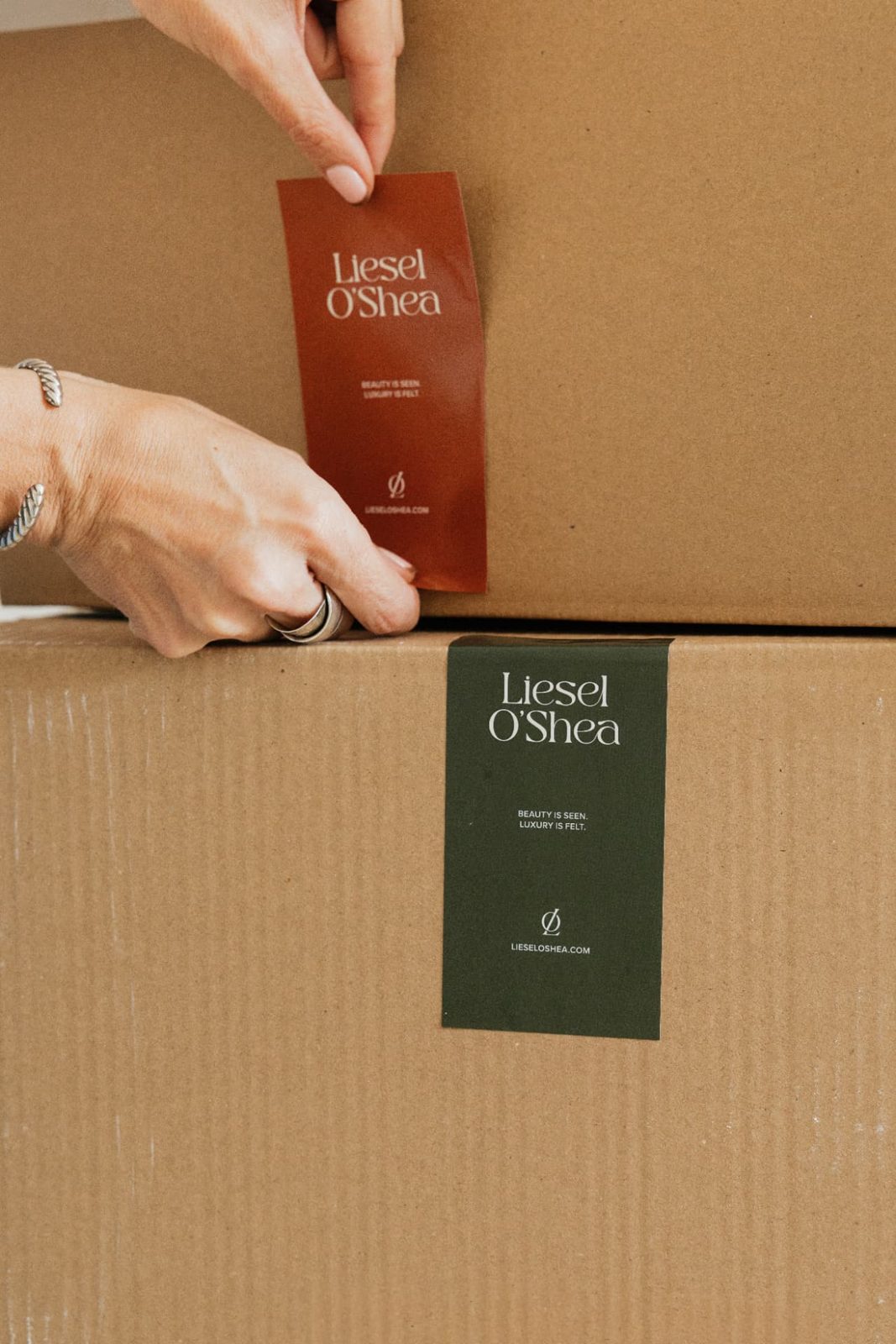
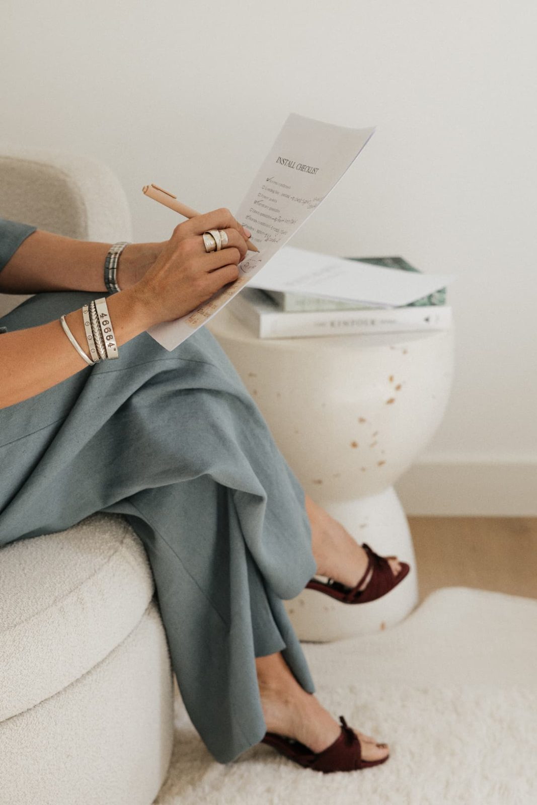
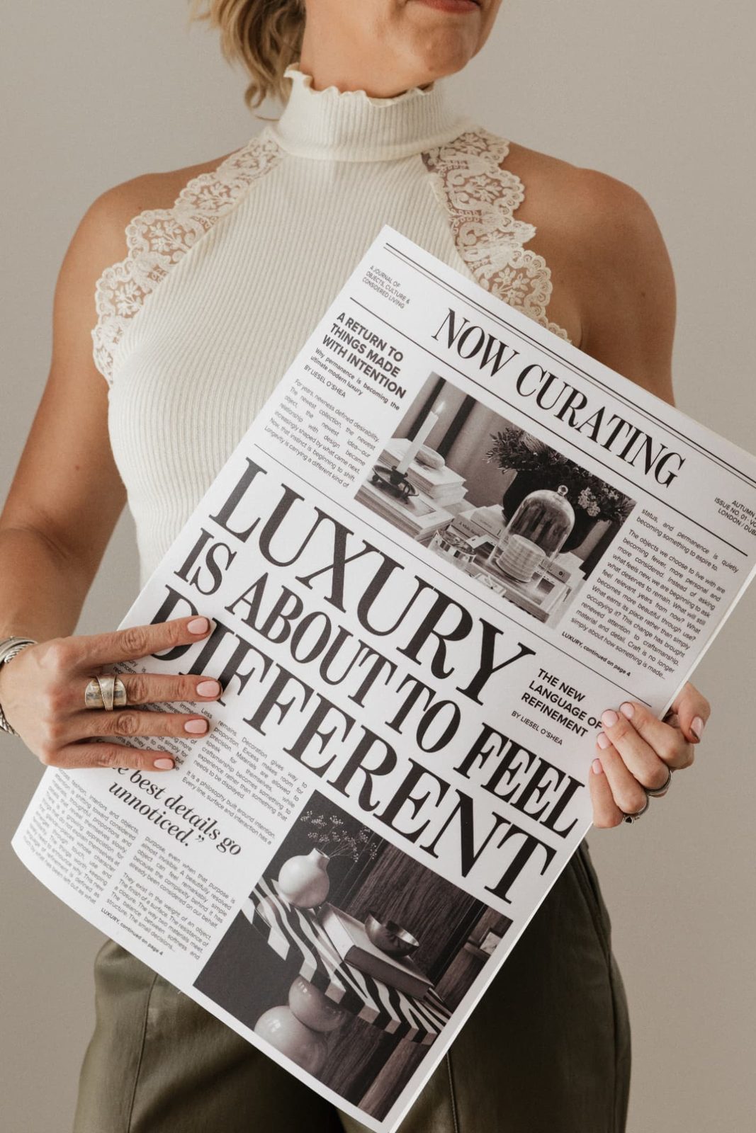
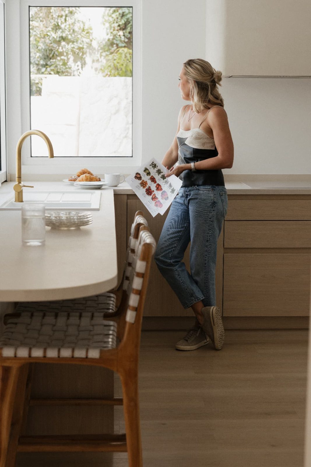
Powerful yet raw, capturing the person behind the work. Quiet, candid moments in warm natural light, soft focus and gentle contrast, with wardrobe in earthy neutrals and muted tones.
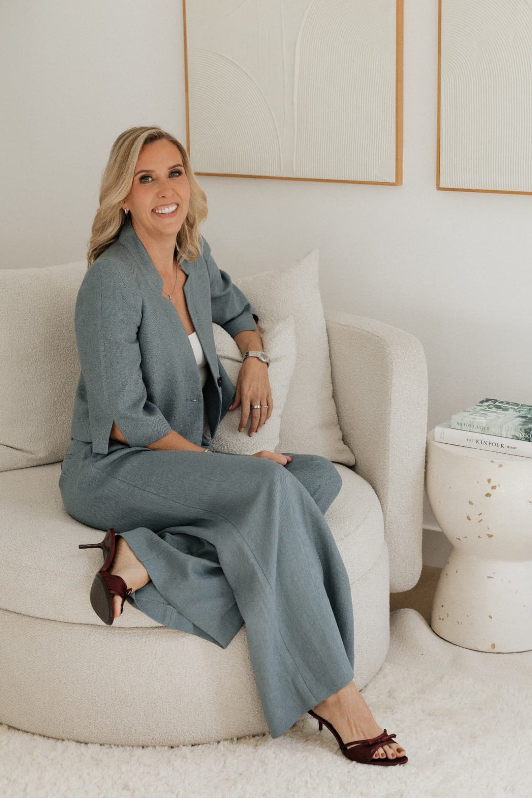
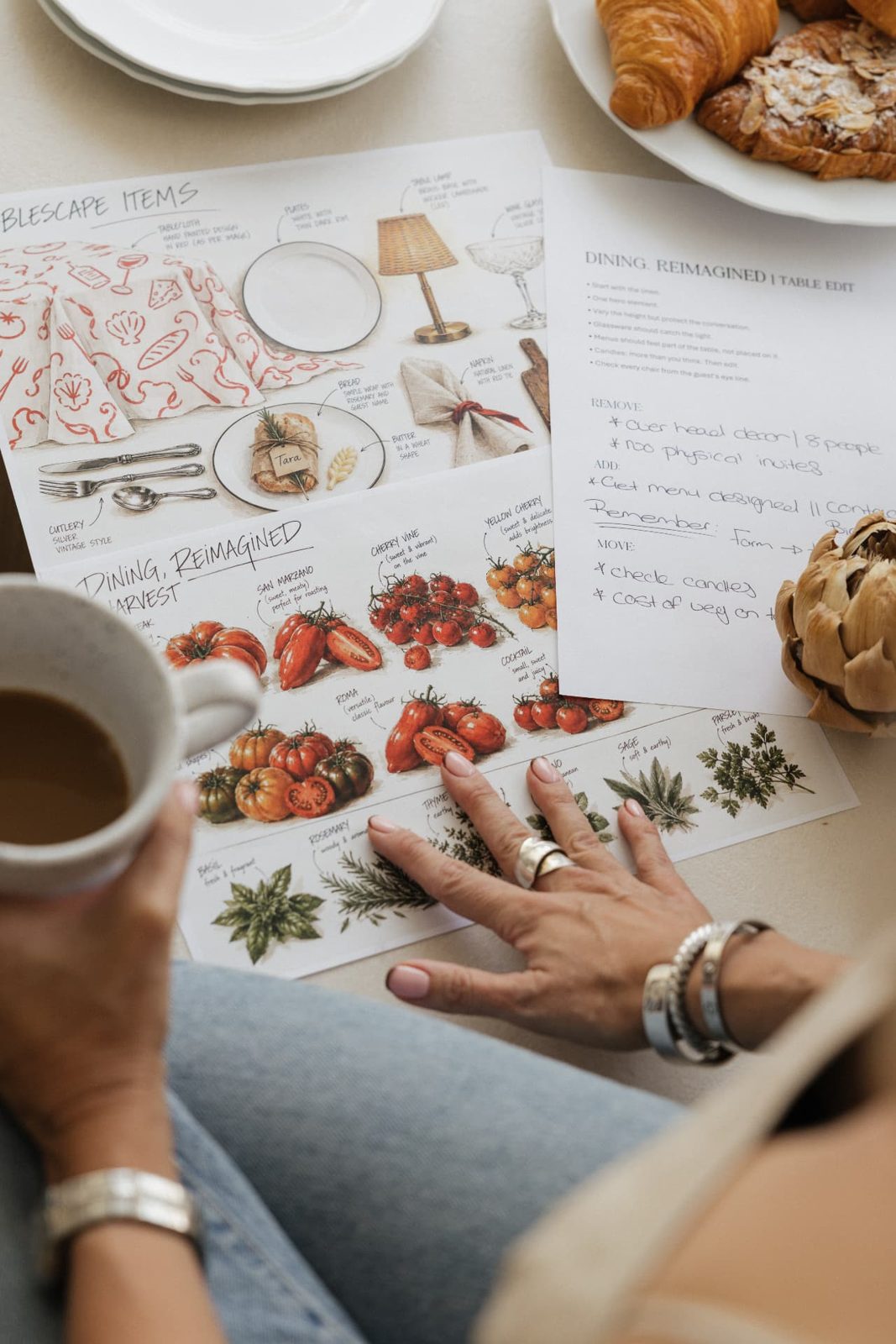
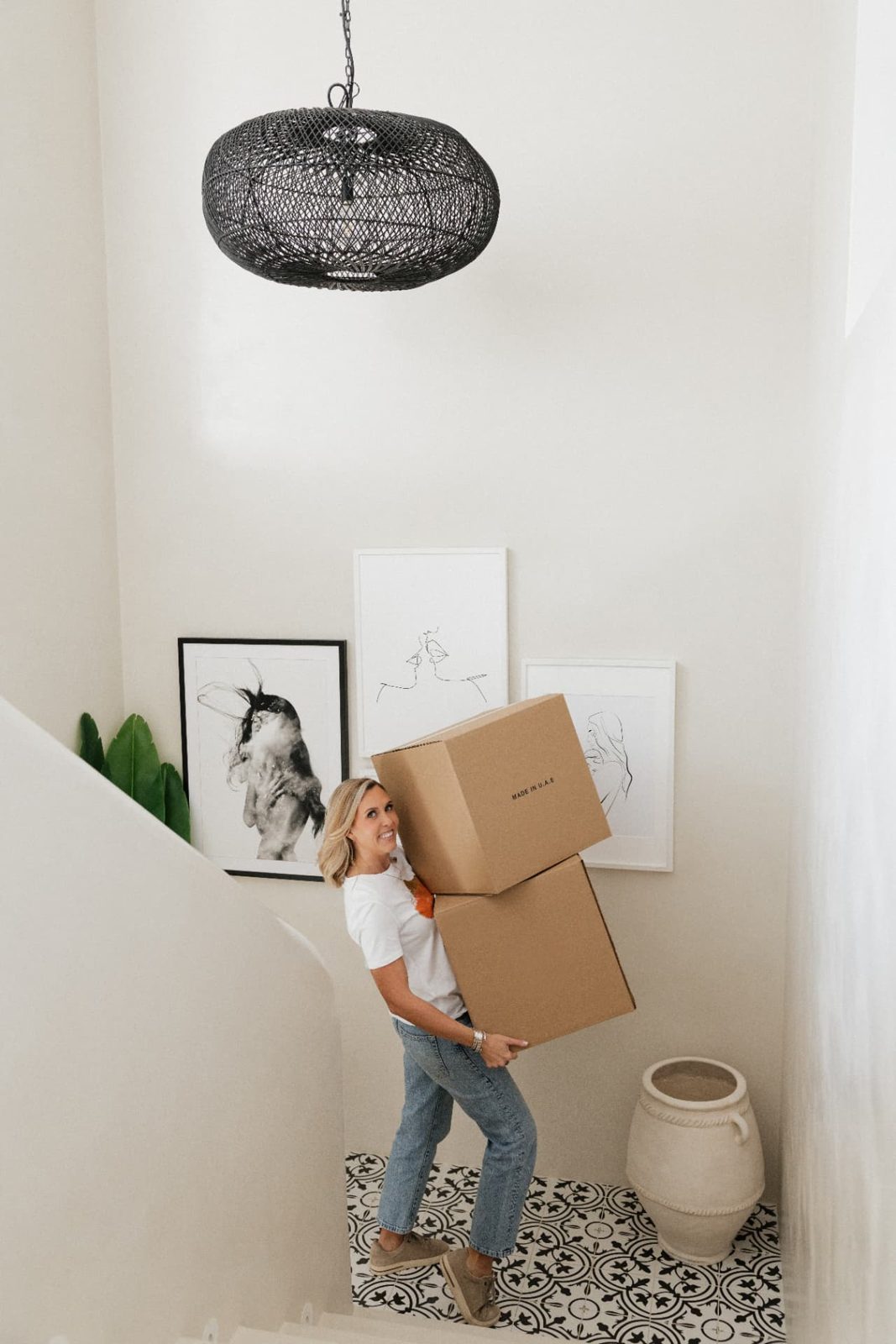
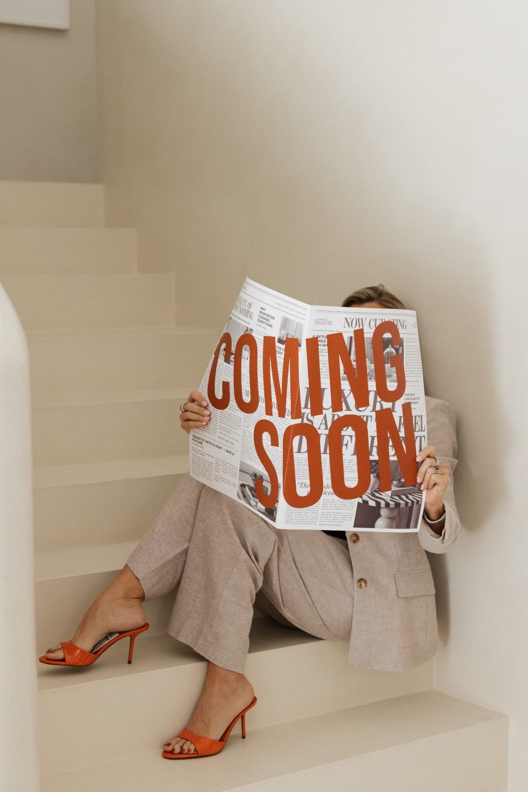
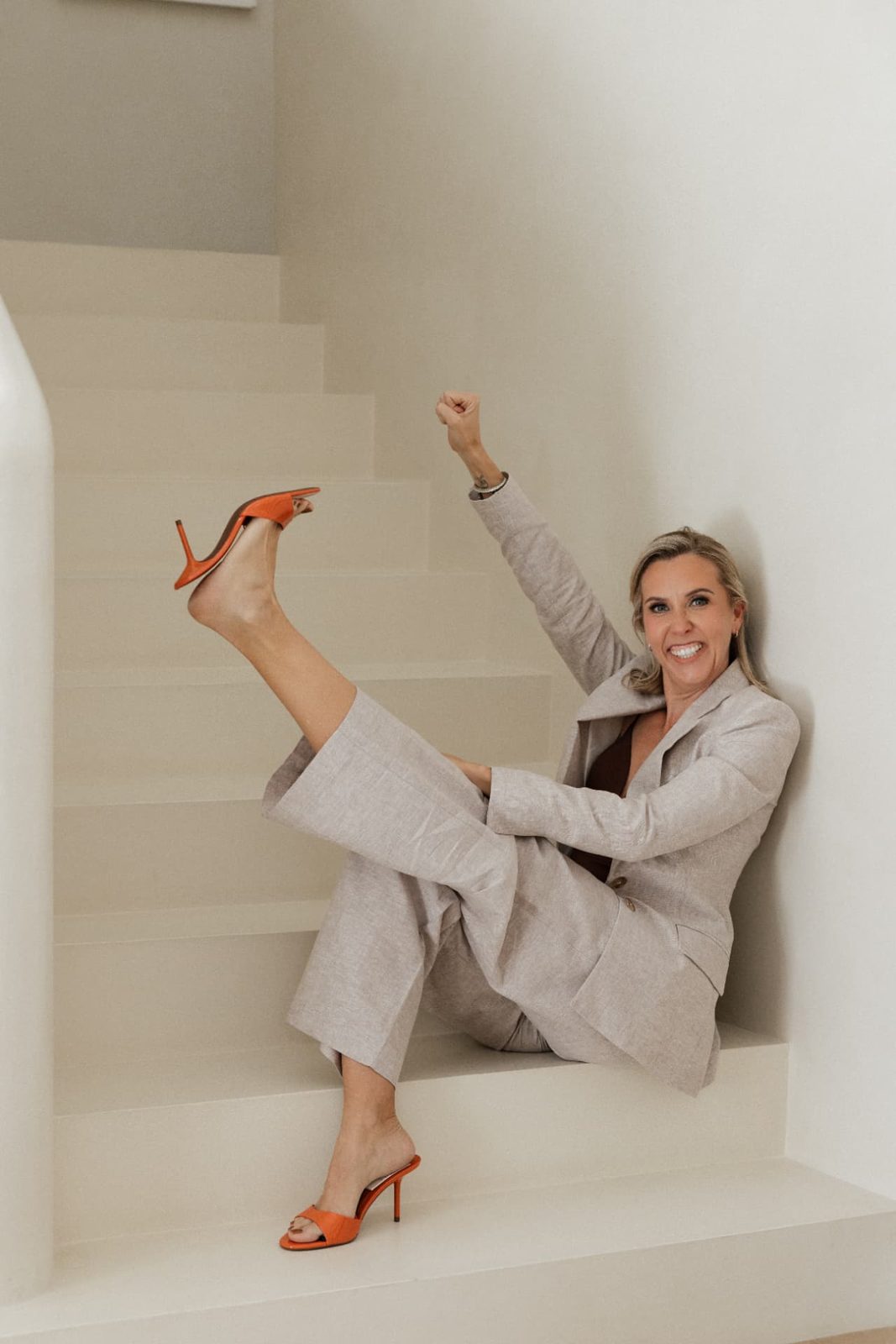
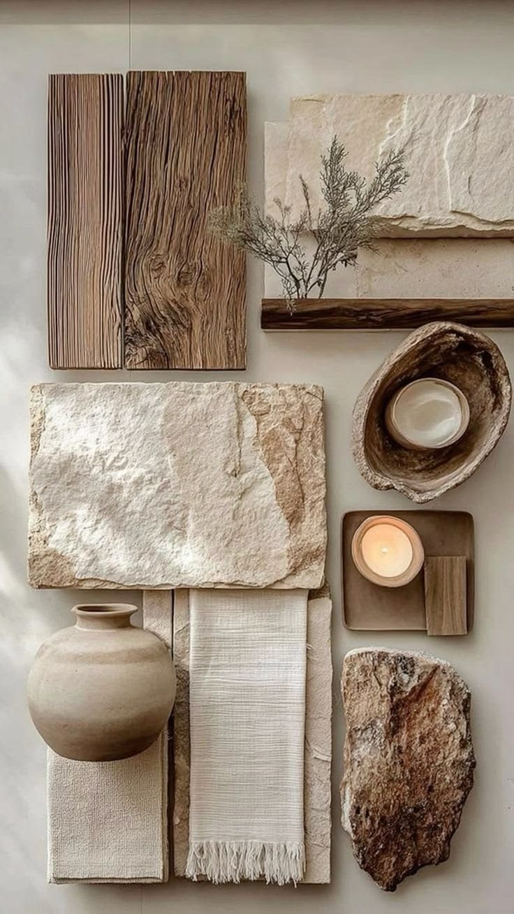
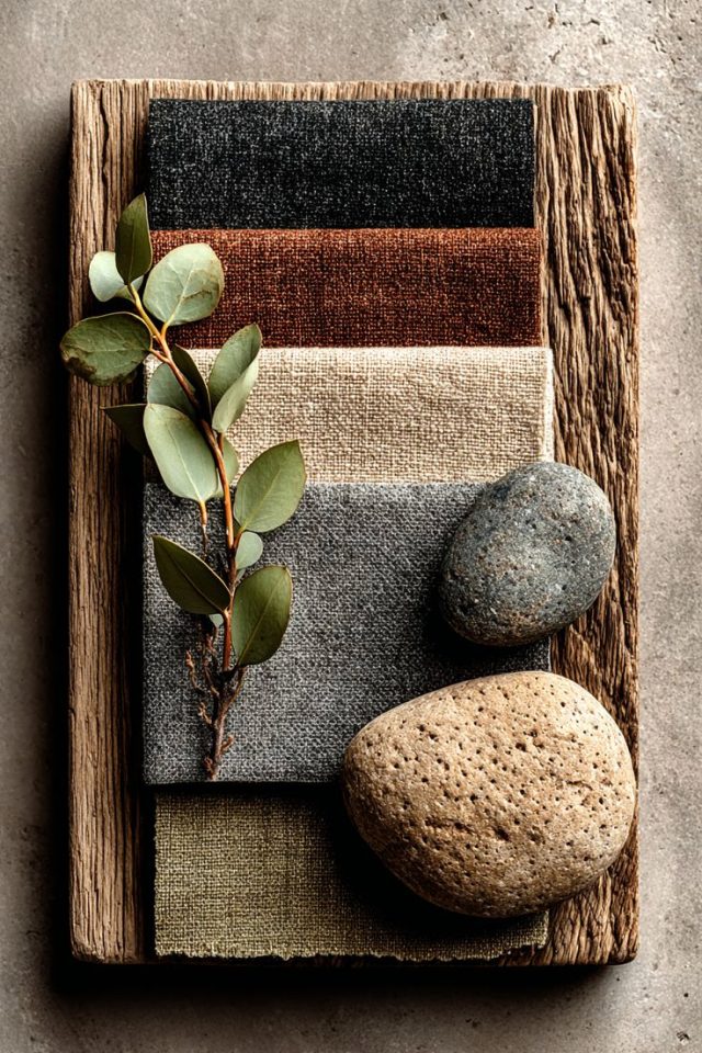
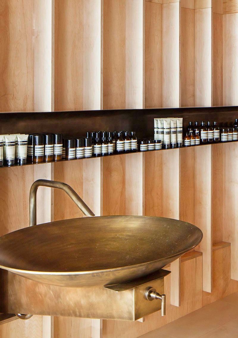
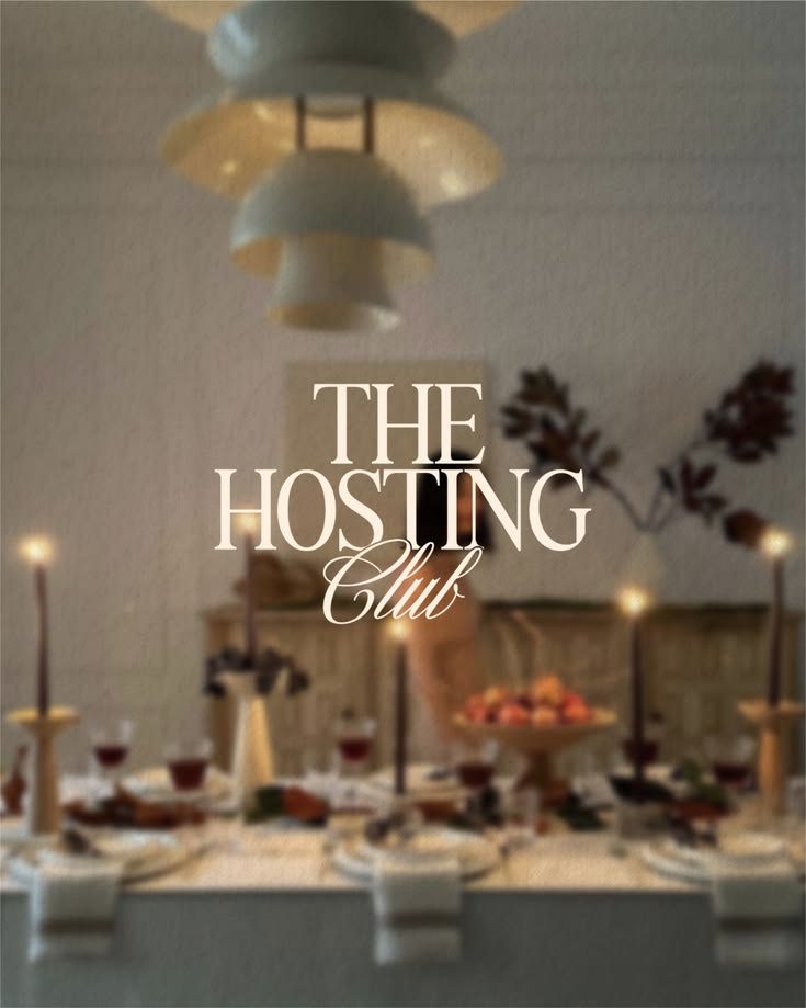
Mood board · Linen, walnut, limestone, stone
Applications
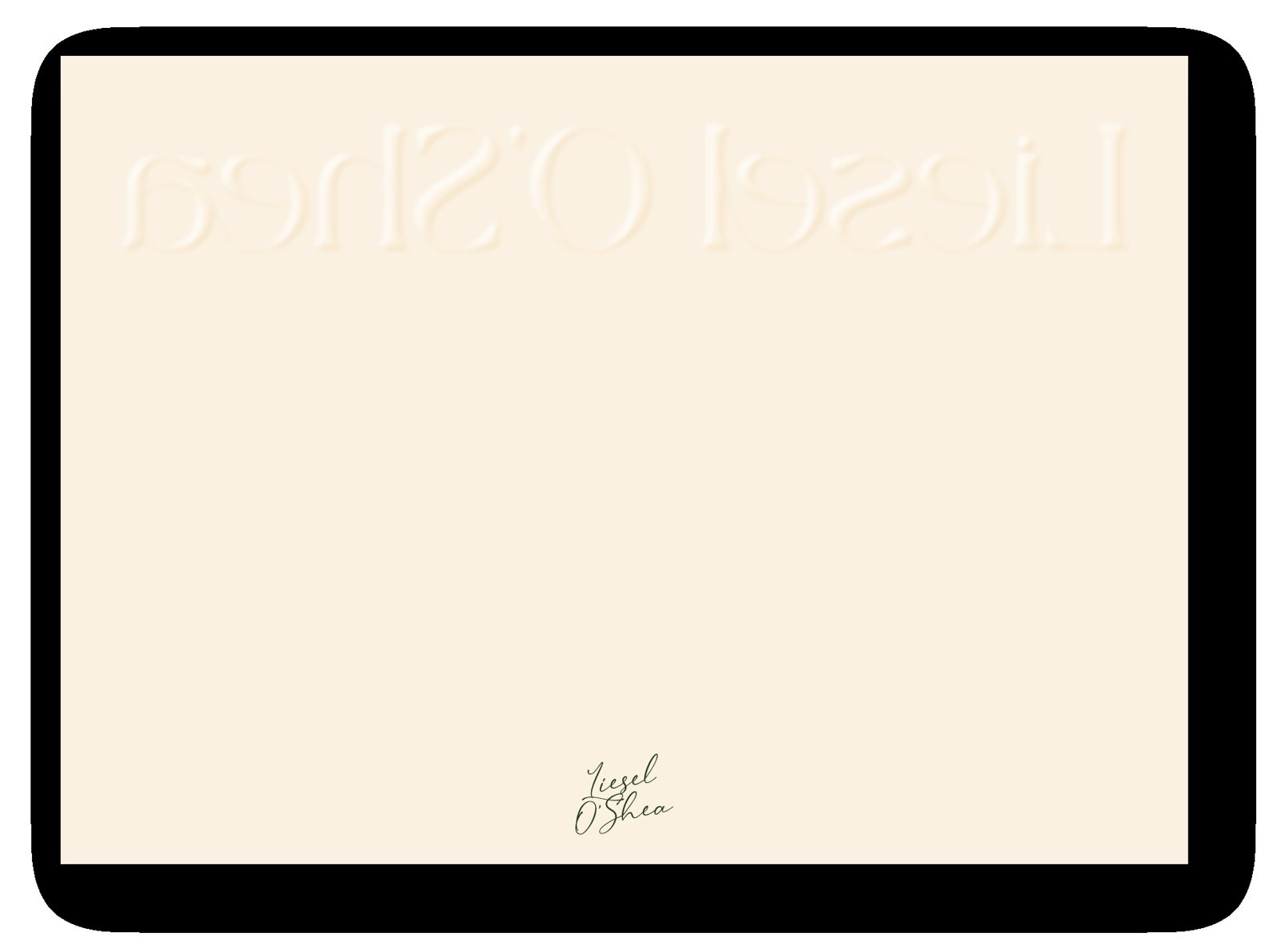
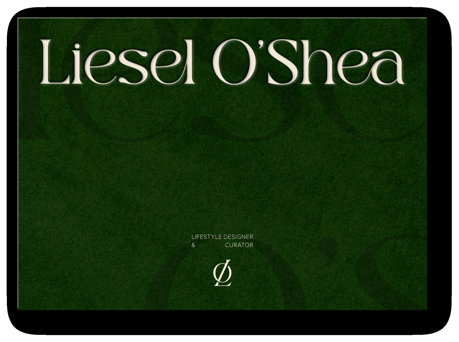
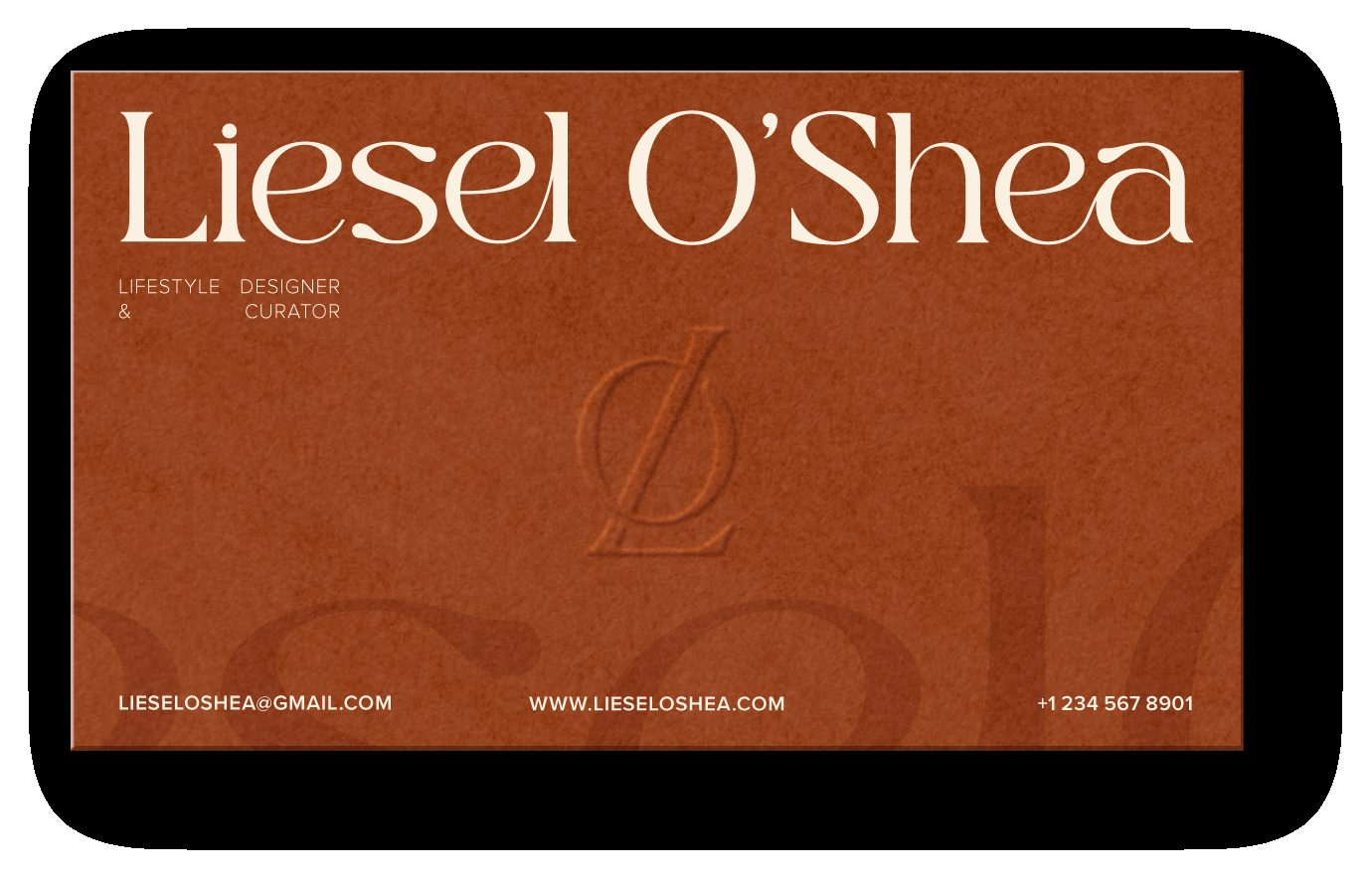
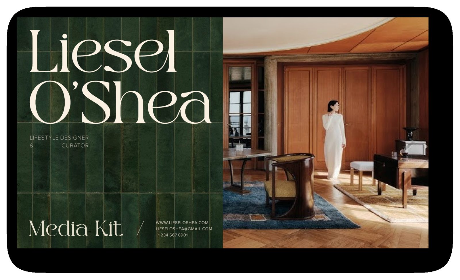
Stationery, media kit and social: how the identity comes together across touchpoints.